I’ve been using @extend in my css to create icon classes where it’s easy to change the icon, pretty basic stuff.
.save-icon {
  @extend .fas;
  @extend .fa-save;
  color: $danger;
  &:hover {
    color: lighten($danger, 30%);
  }
}
Then I wanted to the icon to have a label and align it with the icon, I needed a container css class wrapping the icon and label.
.icon-container {
  display: inline-block;
  text-align: center;
  vertical-align: middle;
  margin-left: 20px;
  .icon {
  }
  .icon-label {
    display: block;
  }
  font-size: 120%;
  &.small {
    font-size: 65%;
  }
  &.medium {
    font-size: 75%;
  }
}
.save-label {
@extend .icon-label;
color: $danger;
}<a href....>
<div class="save-icon">
<span class="save-icon"></span>
<span class="save-label">Save</span>
</div>
</a>For every icon this requires:
- Two classes, icon and label
- Label content in the html, instead of css
- Each class specifies the colors and hover actions
- #toomuch …
For me this is too much code and maintenance. Updates touch more code and requires more testing, enter @mixins.
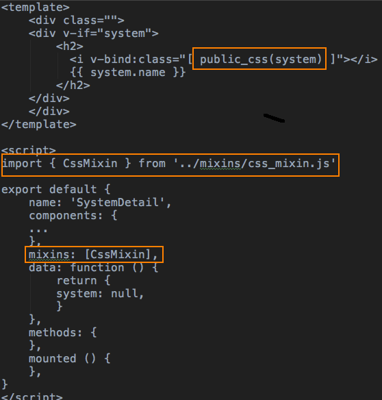
The @mixin below gives us the flexibility to specify the font, label content and color all while implementing features to icons that should be consistent.
@mixin icon-cont($icon_class, $icon_label, $icon-color) {
  display: inline-block;
  text-align: center;
  vertical-align: middle;
  margin-left: 20px;
  font-size: 120%;
  .icon, .label {
    color: $icon-color;
    :hover > & {
      color: lighten($icon-color, 30%);
    }
  }
  .icon {
    @extend .fas;
    @extend #{$icon_class};
  }
  .label {
    display: block;
    &:after {
      content: $icon_label;
      text-transform: uppercase;
    }
  }
  &.small {
    font-size: 65%;
  }
  &.medium {
    font-size: 75%;
  }
  &.selected {
    border-bottom: 3px solid $icon-color;
    &:hover {
      border-bottom: 3px solid lighten($icon-color, 30%);
    }
  }
}
The two other benefits are we not need one css class for each icon/label and they are “one liners”.
.save-icon {
  @include icon-cont('.fa-save', 'save', $danger);
}
Oh yeh the html is simpler.
<a href....>
  <div class="save-icon">
    <span class="icon"></span>
    <span class="label">Save</span>
  </div>
</a>
Not only is this less code overall it’s easy to add new functionality. Notice, the @mixin has &.selected, this is to emphasis what was selected.
&.selected {
  border-bottom: 3px solid $icon-color;
}
Below we are looking at the request statuses and it’s current state, accepted. Furthermore we could easily add a background color to indicate an icon was selected or disabled.


 tech brown bags